Dynamic Map Example: Navigating the Modern World
In an ever-evolving world, the way we navigate and understand our surroundings is undergoing a significant transformation. Traditional maps, with their static nature, often fall short in capturing the dynamic essence of our modern environment, leading to inefficiencies and missed insights. Dynamic maps, by contrast, offer real-time, interactive visualizations that adapt to display relevant data, from traffic patterns to energy sources, making them a cornerstone of modern navigation and analysis. This blog post will delve into the revolutionary shift towards dynamic mapping, explore various impactful examples ranging from New York City’s pulse to the distribution of minimum wage workers, and discuss how these innovative maps are reshaping our understanding of the world.Digital Navigation: Revolutionizing Mapmaking
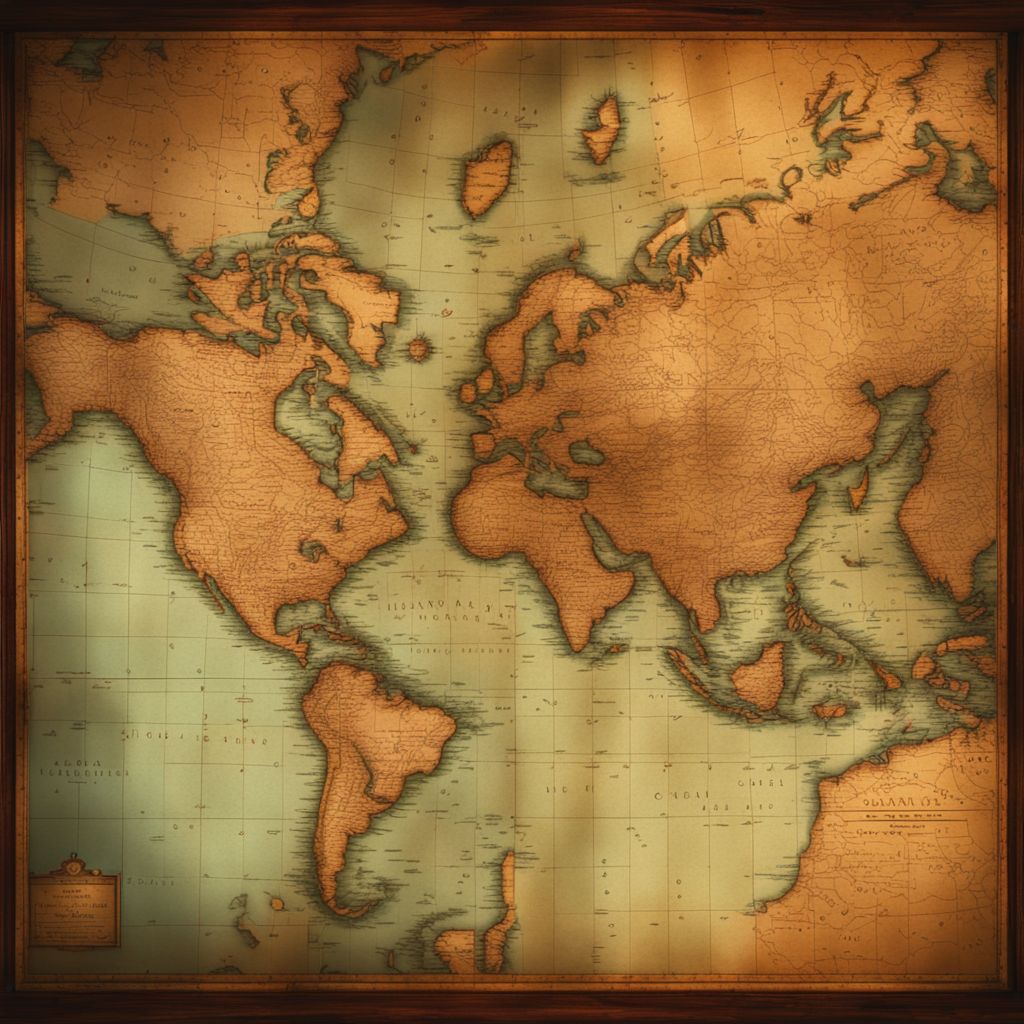 The advent of digital navigation has ushered in a revolutionary change in the field of mapmaking, fundamentally altering how we visualize and interact with geographical information. This transformation is characterized by the transition from traditional static maps, which offer a fixed view of the world, to dynamic, interactive maps. These modern maps are not just tools for finding directions; they are comprehensive platforms that integrate real-time data, offering a more accurate and interactive experience. This shift has expanded the role of maps from mere navigational aids to powerful tools for data analysis and decision-making.
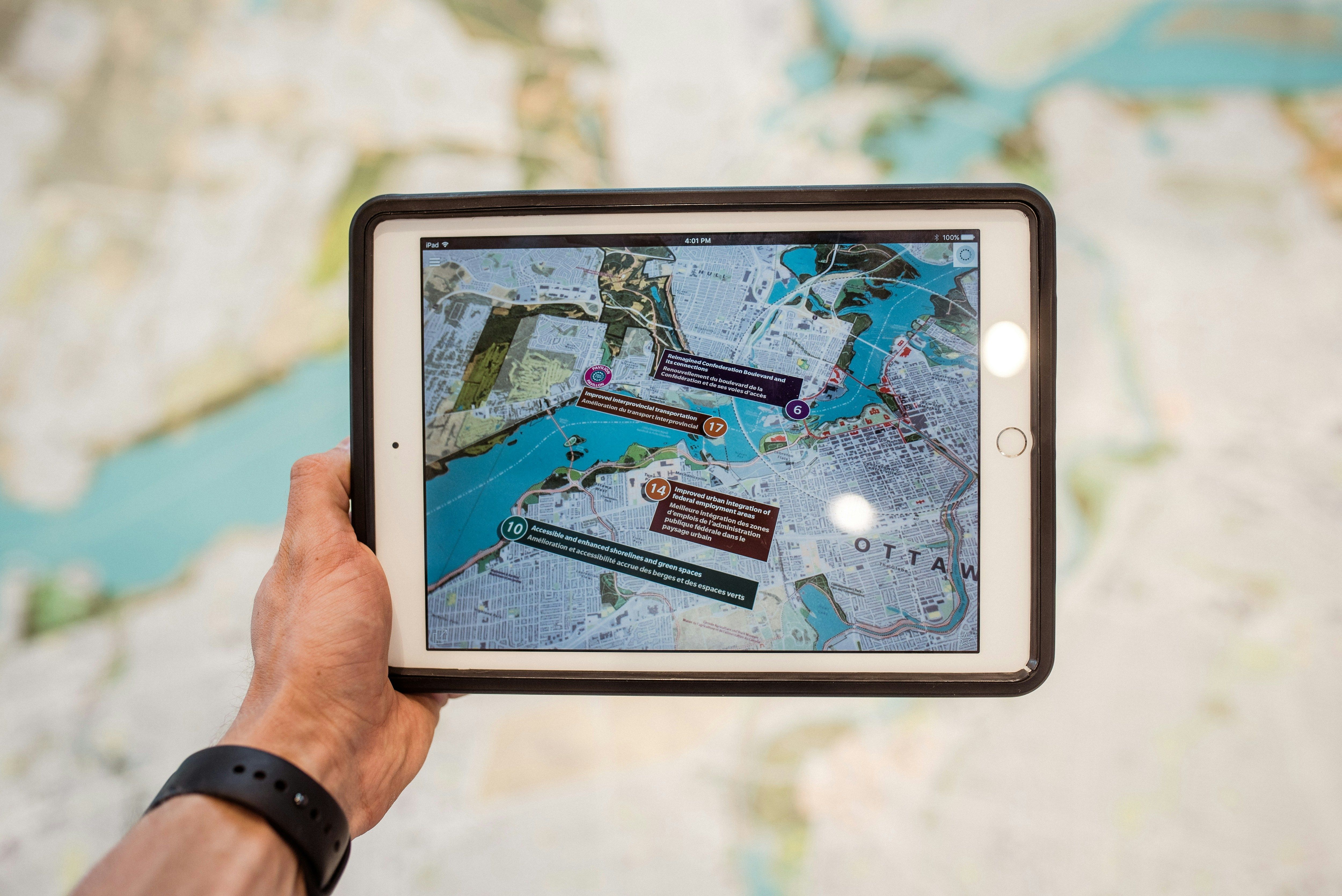
Dynamic maps have become indispensable in various sectors, including urban planning, transportation, and environmental monitoring, by providing detailed, up-to-date information that adapts to the user’s needs. Interactive features such as zooming, panning, and filtering allow users to explore data layers and gain insights that were previously inaccessible with static maps. Furthermore, the ability to integrate user-generated content and real-time updates has made these maps more relevant and useful, marking a significant leap forward in how we understand and navigate our world.
The advent of digital navigation has ushered in a revolutionary change in the field of mapmaking, fundamentally altering how we visualize and interact with geographical information. This transformation is characterized by the transition from traditional static maps, which offer a fixed view of the world, to dynamic, interactive maps. These modern maps are not just tools for finding directions; they are comprehensive platforms that integrate real-time data, offering a more accurate and interactive experience. This shift has expanded the role of maps from mere navigational aids to powerful tools for data analysis and decision-making.
Dynamic maps have become indispensable in various sectors, including urban planning, transportation, and environmental monitoring, by providing detailed, up-to-date information that adapts to the user’s needs. Interactive features such as zooming, panning, and filtering allow users to explore data layers and gain insights that were previously inaccessible with static maps. Furthermore, the ability to integrate user-generated content and real-time updates has made these maps more relevant and useful, marking a significant leap forward in how we understand and navigate our world.
Interactive Maps: Bringing Data to Life
 Interactive maps have transformed the way we interact with data, making complex information more accessible and engaging. By incorporating features like clickable icons, pop-up windows, and animations, these maps bring data to life, allowing users to explore and understand detailed information with ease. Whether it’s tracking live traffic updates, visualizing environmental changes, or exploring demographic statistics, interactive maps provide a dynamic platform that enhances user engagement and improves data comprehension. This level of interactivity not only makes information more memorable but also encourages further exploration and discovery.
Platform Benefits: Saving Time and Cutting Costs
Adopting dynamic map platforms offers significant benefits, notably in saving time and reducing costs. For businesses, integrating indoor and outdoor navigation with space management systems streamlines operations, optimizes resource allocation, and enhances customer experience. Employees and visitors benefit from easy-to-navigate, real-time information, reducing confusion and improving satisfaction. Additionally, the ability to manage hybrid work environments and efficiently utilize office space can lead to considerable cost savings, proving that dynamic maps are a valuable investment for modern businesses looking to stay ahead in a rapidly changing world.NYC’s Heartbeat: A Dynamic Map Example
 Imagine a map that captures the essence of New York City - not just its streets and landmarks, but its living, breathing energy. This is exactly what a dynamic map of NYC’s “invisible heartbeat” does. By visualizing data like traffic flow, population movement, and energy consumption, this map offers a glimpse into the city’s dynamic rhythm. Interactive elements allow users to see how these patterns change throughout the day, making the invisible visible.
The beauty of this dynamic map lies in its ability to:
Imagine a map that captures the essence of New York City - not just its streets and landmarks, but its living, breathing energy. This is exactly what a dynamic map of NYC’s “invisible heartbeat” does. By visualizing data like traffic flow, population movement, and energy consumption, this map offers a glimpse into the city’s dynamic rhythm. Interactive elements allow users to see how these patterns change throughout the day, making the invisible visible.
The beauty of this dynamic map lies in its ability to:
- Highlight peak traffic times and areas of congestion
- Show fluctuations in energy use as the city wakes up and winds down
- Track the movement of people, revealing the city’s most vibrant hubs at different times
Visualizing Public Holidays with Dynamic Maps
Dynamic maps have revolutionized the way we visualize complex datasets, and their application in showcasing public holidays across different countries is a fascinating example. By using dynamic mapping, users can interactively explore which countries are celebrating on any given day of the year. This not only highlights the cultural diversity of global celebrations but also allows for an engaging comparison of statutory holidays. Key features such as clickable regions and pop-up information make these maps a powerful tool for understanding the world’s myriad of public holidays at a glance. For instance, selecting a specific holiday on a dynamic map could reveal which countries recognize this day as a public holiday and provide additional context about its significance. Benefits of using dynamic maps for this purpose include:- Easy identification of holidays celebrated worldwide or in specific regions
- Insights into the cultural significance behind various holidays
- The ability to track holiday observances over time, enhancing our appreciation of global traditions. This dynamic approach to visualizing public holidays not only educates users about international cultures but also fosters a greater sense of global community by connecting us through our shared celebrations.
Mapping U.S. Electricity Sources Dynamically
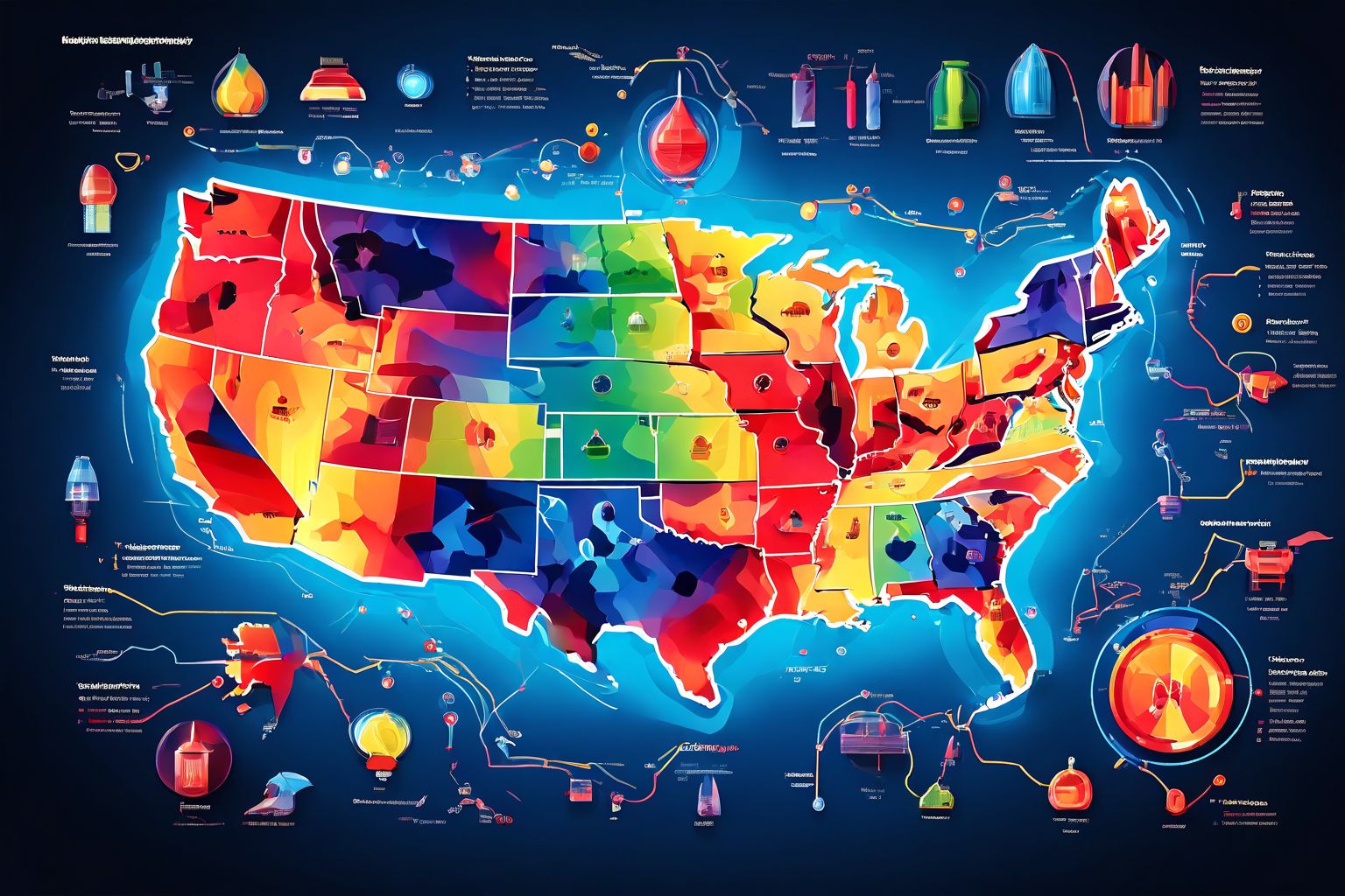 Dynamic maps bring a new level of understanding to the complex landscape of U.S. electricity production, highlighting the diverse sources that power the nation. By visualizing data in real-time, these maps allow users to see how electricity generation varies from state to state, driven by factors such as natural resources, policy decisions, and technological advancements. Key features of dynamic electricity maps include the ability to filter by energy source—such as solar, wind, nuclear, and fossil fuels—and to view the operational status of power plants, making it easy to grasp the country’s energy mix at a glance.
Beyond just identifying where electricity comes from, dynamic maps offer insights into trends and shifts in energy production. For instance, users can track the growth of renewable energy over time or see how certain events, like natural disasters or policy changes, impact electricity generation. Benefits of using dynamic maps for visualizing U.S. electricity sources include:
Dynamic maps bring a new level of understanding to the complex landscape of U.S. electricity production, highlighting the diverse sources that power the nation. By visualizing data in real-time, these maps allow users to see how electricity generation varies from state to state, driven by factors such as natural resources, policy decisions, and technological advancements. Key features of dynamic electricity maps include the ability to filter by energy source—such as solar, wind, nuclear, and fossil fuels—and to view the operational status of power plants, making it easy to grasp the country’s energy mix at a glance.
Beyond just identifying where electricity comes from, dynamic maps offer insights into trends and shifts in energy production. For instance, users can track the growth of renewable energy over time or see how certain events, like natural disasters or policy changes, impact electricity generation. Benefits of using dynamic maps for visualizing U.S. electricity sources include:
- Enhanced decision-making for policy makers and energy professionals
- Increased public awareness of renewable energy adoption
- Real-time updates on energy infrastructure developments. This dynamic approach not only educates but also engages the public in discussions about sustainable energy and the future of electricity in the U.S.
Dynamic Mapping of Minimum Wage Workers
Dynamic mapping has taken a significant leap forward by shedding light on the economic landscape of minimum wage workers across the U.S. This innovative approach provides a vivid, real-time illustration of wage disparities, highlighting areas where workers struggle the most to meet their basic needs. By integrating data from various sources, such as the U.S. Department of Labor and the Living Wage Calculator, these maps offer a comprehensive view of:- The distribution of minimum wage workers by state or congressional district
- The gap between minimum wages and living wages in different regions
- The impact of recent legislation on wage levels
- Facilitating a better understanding of the geographic distribution of low-wage workers
- Highlighting the effectiveness of wage increases in various states
- Offering a dynamic, easily accessible platform for engaging with complex wage data
World Cup Ratings: A Dynamic Visualization
 The 2018 FIFA World Cup not only captivated soccer fans worldwide but also provided a unique opportunity to visualize global interest through dynamic mapping. By combining player ratings from FIFA 18 with team performance data, an interactive map was created to show how players at each position compared to their competitors across the globe. This dynamic visualization offered insights into:
- The distribution of top-rated players in different countries
- Comparisons between teams based on player ratings
- Trends in player performance throughout the tournament
- Engaging fans in a deeper analysis of the game
- Providing a global perspective on the talent distribution
- Offering real-time updates as player ratings changed throughout the tournament. This approach not only made the vast amount of statistical data comprehensible but also added an engaging layer to the World Cup experience, demonstrating the power of dynamic mapping in sports analytics.
Mapping the World’s Languages Dynamically
 Imagine a map that doesn’t just show you where you are, but also speaks your language. This is the reality with dynamic maps showcasing the world’s languages. These maps are not static; they change and adapt to display the languages spoken in different regions, highlighting the incredible diversity of our planet. By selecting a country or region, users can discover:
- The primary language spoken
- Various dialects present in the area
- Minority languages that contribute to the cultural richness
- Enhancing linguistic awareness and cultural sensitivity
- Providing a valuable resource for language learners and educators
- Offering insights into language distribution and prevalence, which can be crucial for sociolinguistic research. These maps transform our perception of language, from a mere means of communication to a vibrant indicator of human diversity and culture.
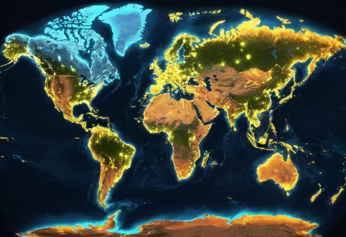
Visualizing Net Migration with Dynamic Maps
Dynamic maps have the unique ability to visualize complex global phenomena like net migration in a way that is both engaging and informative. By mapping the flow of people between countries, users can gain insights into patterns of migration, including which countries are experiencing an influx of people and which are seeing more people leave. These maps often use color coding—such as blue for positive net migration and red for negative—to provide a clear, at-a-glance understanding of global migration trends. The benefits of using dynamic maps for visualizing net migration are numerous. They allow users to:- Easily identify hotspots of immigration and emigration
- Understand the impact of political, economic, or environmental factors on migration
- Explore data in an interactive manner, drilling down for more detailed information on specific countries or regions. This approach not only enhances our comprehension of global migration patterns but also fosters a deeper awareness of the forces driving these movements.
Star Mapper: Navigating the Night Sky
Imagine a tool that not only shows you the constellations but also guides you through the night sky as it changes throughout the year. That’s exactly what “Star Mapper” does. This dynamic map is an incredible example of how technology can enhance our understanding of astronomy. By selecting different dates and locations, users can see how the night sky shifts, identifying constellations, planets, and celestial events with ease. Key features of Star Mapper include:- Interactive constellation guides
- Real-time celestial event tracking
- Customizable views based on user location and date
- Enhancing users’ knowledge of the night sky
- Encouraging exploration and discovery of new celestial phenomena
- Offering an accessible way to plan stargazing sessions based on specific astronomical events. This dynamic approach to mapping the stars makes astronomy more engaging and accessible to everyone, turning a simple glance at the night sky into an informative and interactive experience.
Mapping Solar Eclipses Dynamically Until 2080
Imagine a dynamic map that not only pinpoints where and when every solar eclipse will occur up until 2080 but also offers an interactive journey through these celestial events. This map is a brilliant example of how dynamic mapping transforms our interaction with astronomical events, making it possible to visualize the path of totality for each eclipse on a global scale. Users can explore various dates to see how the shadows of the moon cast upon the Earth will change, providing a vivid, educational experience that static maps simply cannot match. The benefits of such a dynamic eclipse map are vast, enhancing both educational and planning purposes. For instance, educators can use the map to show students the science behind eclipses in an engaging way, while eclipse chasers can plan their next adventure to witness this awe-inspiring natural phenomenon. Key features include:- Interactive timelines that allow users to scroll through future eclipses
- Filter options to view eclipses by type, such as total, annular, or partial
- Location-specific details about the best viewing times and conditions. This dynamic approach not only educates but also excites, making the cosmic dance of the sun, moon, and Earth accessible to all.
Graffiti Around the World: A Dynamic Map View
Imagine a dynamic map that takes you on a global tour of street art, from the vibrant graffiti-covered walls of Berlin to the intricate murals of São Paulo. This map isn’t just a collection of locations; it’s an interactive journey through the world’s urban landscapes, showcasing the rich tapestry of street art that adorns cities across continents. Key features of this dynamic map include:- Interactive markers for each piece of graffiti, offering details about the artist and the artwork’s significance
- Filters to explore street art by region, style, or artist, making it easy to find specific types of work or discover new favorites
- Real-time updates, allowing users to contribute new finds and ensuring the map remains an up-to-date reflection of the street art scene worldwide.
- Gain insights into the social and political messages often conveyed through graffiti
- Appreciate the role of street art in urban beautification and cultural expression
- Connect with a global community of street art enthusiasts, fostering a deeper understanding and appreciation of this art form. This dynamic approach not only educates but also inspires, turning the exploration of street art into an engaging and immersive experience.